Page 6 of 14
Re: Veph's Graphics - Avatars & Signatures
Posted: Fri Feb 12, 2010 5:09 pm
by Kalliope
Okay, Veph, finally got an assignment for ya! xD
I was never totally happy with how my avatar turned out and it definitely lost even more quality when I shrank it to meet the requirements here.
The version I have for my guild's forum is 148x160. The version I have here is 90x97. The original version is attached below for reference, but I only need the other two sizes for my avatars.
I'm basically looking for something similar to what I have, only more finished/polished. Everything blends together too much at the moment and I don't think it translates well, especially not in the smaller format.
The second picture is the one I used as my base, but I attached the third for more options in case that helps.
Thanks in advance! ^_^
Re: Veph's Graphics - Avatars & Signatures
Posted: Fri Feb 12, 2010 5:30 pm
by Vephriel
Re: Veph's Graphics - Avatars & Signatures
Posted: Fri Feb 12, 2010 6:05 pm
by Nikrosnil
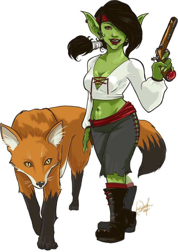
Vephriel, would you mind making me an avatar, using the art I linked, with some part of booty bay as the background? I just think you'll do a better job than I will. It's up to you, though. ^^
Art:
http://i287.photobucket.com/albums/ll15 ... sion-2.jpg
Re: Veph's Graphics - Avatars & Signatures
Posted: Fri Feb 12, 2010 6:16 pm
by Vephriel
How's this? ^^

Re: Veph's Graphics - Avatars & Signatures
Posted: Fri Feb 12, 2010 6:18 pm
by Nikrosnil
That's brilliant! Thanks Veph. ^^
Re: Veph's Graphics - Avatars & Signatures
Posted: Fri Feb 12, 2010 6:21 pm
by Kalliope
Hmmm....sorry in advance for being nitpicky. >_<
I think the picture shifted up and left from where I had cropped it. I like how you do borders; maybe one like the one on your avatar would give more space to work with.
I like how you moved the "Kalliope" text to the center; I'm not sure why I had pushed it to the left now. O_o I think I may need to go font-hunting, as nothing seems to shrink well to be readable. >_< (And that holds true for the fonts I had used originally, so this is just a chronic problem.)
Thanks for working on this; you've gotten me thinking again!

EDIT: Gah, I can't attach the fonts to the forum, as it won't accept ttf extensions. Maybe I could throw on the text if you get the border sorted? *ponderponder*
Re: Veph's Graphics - Avatars & Signatures
Posted: Fri Feb 12, 2010 6:23 pm
by Vephriel
Heh, no worries! I think the shifting part may just bea mind trick. I didn't crop or edit the provided image you gave me, but the coloured borders I did are thinner than your original (I realized after when seeing them beside each other). Plus the outer borders I use shrink the visible picture a slight bit.
Fonts are indeed hard to manage on small skill, particularly fancy or nice looking fonts. I tried to keep a similar look to your original ones, but I realize they didn't come out ideal.
Want me to try something without the green and purple blocks? I think it's a neat idea seeing as how the figure is stationed more towards the left and top of the picture, so those colour blocks help fill the space leftover on the right.
EDIT: Here are the 'raw' templates if you wanted them:
Re: Veph's Graphics - Avatars & Signatures
Posted: Fri Feb 12, 2010 6:45 pm
by Kalliope
Oooh, it IS the border that's cropping off the top of her head; you're right!
And yes, that's what I was originally doing with the blocks. ^_^ I think maybe I constrained you too much in my original request; didn't give you enough room to really interpret it freely. Go for it!

You'll probably come up with something I didn't think of at all.
Re: Veph's Graphics - Avatars & Signatures
Posted: Fri Feb 12, 2010 7:01 pm
by Vephriel
Haha, okies, I'll play around with it some more.
Do you want both 'Kalliope' and 'Muse' on it still?
EDIT: Testing out an idea...what do you think?
Re: Veph's Graphics - Avatars & Signatures
Posted: Fri Feb 12, 2010 7:28 pm
by Kalliope
Oooh...!
That font DEFINITELY works and is better than the ones I had found. If the letters on Kalliope were spaced out more evenly, that would be perfect! Then it's just a question of finding the right color for the blocks. My original colors blended too much, but the white washes out the whole thing too much. Maybe a pastel/sea green of some sort? Something lighter than what I used.
I knew you'd think of something better! xD
Re: Veph's Graphics - Avatars & Signatures
Posted: Fri Feb 12, 2010 7:31 pm
by Vephriel
*nods* Yeah, I want the spacing to be more even, but the problem is that one word is so much longer than the other.
I'll keep working with it.
Re: Veph's Graphics - Avatars & Signatures
Posted: Fri Feb 12, 2010 7:42 pm
by Vephriel
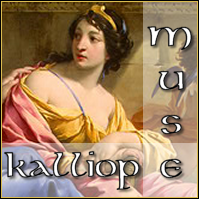
Another version:
Re: Veph's Graphics - Avatars & Signatures
Posted: Fri Feb 12, 2010 8:01 pm
by Kalliope
Oooh....
I like that style! The "Muse" looks slightly lost now...could try tacking on a "the" before it; maybe a horizontal "the" and "Muse" going vertically?
Re: Veph's Graphics - Avatars & Signatures
Posted: Fri Feb 12, 2010 8:04 pm
by Vephriel
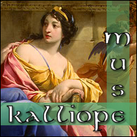
Hmm, something like this?
Re: Veph's Graphics - Avatars & Signatures
Posted: Fri Feb 12, 2010 8:10 pm
by Kalliope
Yes, like that, only in the same font/style/etc. and the "the" can be undersized, within the bar.
Re: Veph's Graphics - Avatars & Signatures
Posted: Fri Feb 12, 2010 8:15 pm
by Vephriel
The font's the same, but at that small size I can't put a black border around the letters since the black takes over.
This is about as best as I could do:
Re: Veph's Graphics - Avatars & Signatures
Posted: Fri Feb 12, 2010 8:23 pm
by Kalliope
Ooh, good call. ^_^
Thank you so much, Veph! Will resize and such in a minute; fixing my net. >_<
Re: Veph's Graphics - Avatars & Signatures
Posted: Fri Feb 12, 2010 8:24 pm
by Vephriel
Oh, I can resize it for you.
I also realized I forgot the black border. I'll make one with that as well.
Re: Veph's Graphics - Avatars & Signatures
Posted: Fri Feb 12, 2010 8:31 pm
by Kalliope
Thank you, Veph!!
Ambrosia of gratitude! xD
Re: Veph's Graphics - Avatars & Signatures
Posted: Fri Feb 12, 2010 8:32 pm
by Vephriel
No prob! ^_^ Glad I found something that works for you.