Page 3 of 5
Re: Petopia Usability Improvements
Posted: Sun Jul 25, 2010 5:05 pm
by Karathyriel
Just as I have announced earlier, here is a first "re-design" of the petopia header.
This is nowhere near perfect and surely nowhere near done.
It is just open for discussion, where Manias voice weighs in a lot more then others do!

No, seriously, I think Petopia need a fancier look and maybe we all can do that together.
Opinions, please!
Re: Petopia Usability Improvements
Posted: Sun Jul 25, 2010 5:22 pm
by Saturo
I like it, but the red kind of clashes with the rest of it. Also, Petopia gets to keep it's mascot! :P
Re: Petopia Usability Improvements
Posted: Sun Jul 25, 2010 5:39 pm
by Karathyriel
There used to be a GIF with no background of Petopias mascot. It is not there anymore.
Otherwise I would have used it. Did my best to create a worthy successor.
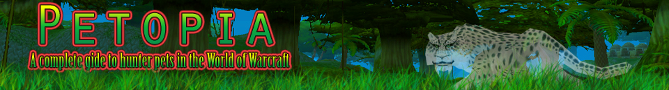
I thought the red was good contrast but here you go:

Is that better? I don't think so... Do you?
Edit: I just saw the typo, so don't comment on that!

Re: Petopia Usability Improvements
Posted: Sun Jul 25, 2010 5:41 pm
by Saturo
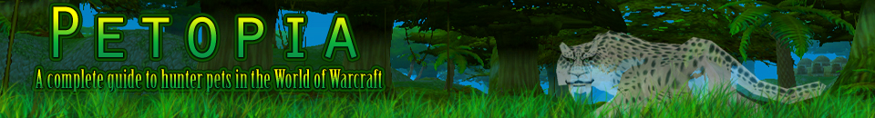
Well, I think it's slightly better. How about a dark green?
Re: Petopia Usability Improvements
Posted: Sun Jul 25, 2010 5:46 pm
by Teigan
.
Re: Petopia Usability Improvements
Posted: Sun Jul 25, 2010 5:47 pm
by Karathyriel
OK, I admit i, green is not bad...
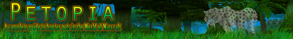
All three in comparison:
Teigan wrote:I keep thinking...why STV + ghostsaber?
Because STV comes to my mind when I think of trees and green and nature.
No other reason!
And now I'm off to bed...

School starts again tomorrow for me.

Re: Petopia Usability Improvements
Posted: Sun Jul 25, 2010 5:51 pm
by Mania
Kalliope wrote:Edit edit: Are your personal notes going to go back on the pages at all? Or are the links to wowhead, etc. going to be it?
You'll find some short comments in the notes section, but I removed some old ones that were out of date and shortened some of the others. I need to do a pass through the data and add a lot of notes yet.
Moonlost wrote:I'm particuarly fond of the "Non-*pet family*s With Similar Looks" that are on relevent pages. I'd like to see the ghost saber added to the spirit beast page, under "Non-Spirit Beasts With Similar Looks".
Good idea! I also added the other ghostly pets to the Spirit Beast page as similar looks, and things like the slime. Let me know if you see any others that should be added!
FuzzyDolly wrote: As I said before it looks awesome, however... when you're looking at an animals page, there is no longer the thottbot link to get to a map of the pet's location. I used that feature almost every time I checked Petopia. Any chance on putting it back or even just linking to a map directly?
I wanted to shorten the text links ("Thottbot - Allakhazam - Wowhead") down into something shorter. I've used just initials before ("T-A-W") but I have trouble clicking on the tiny little links. I figured the icons for each site were a good compromise, but if they don't stand out enough then that doesn't quite work. Do you think it would help if they were in their own column in the table?
Sarayana wrote:A slight bug: When I was browsing warp stalkers (don't know about any other families) the pop-up didn't work properly. It didn't pop up for the three at the bottom until I had hovered over the top left one, and once it did, it just was the same pop-up as that top left one. The text I mean.
No repro. *grin*
Okay, I actually just fixed this up real quick.
Safrienaer wrote:Also it seems that the Nether Rays have no npcs shown at all.

No idea if you just haven't gotten to making them yet, though.
Damn you, "Count" Ungula!
But that bug should also be fixed now.
Explanation for these bugs, if you care: I was originally setting the text for the pretty tooltips in the HTML itself via the title attribute (and JavaScript that turns that into a tooltip). But that means that if you have JavaScript turned off, you still see the normal 'title' hover text -- which is now a huge block of HTML code.
So yesterday I switched to setting the pretty tooltip text programmatically in the JavaScript itself. That works fine, except for two things:
- If there is no tooltip (as for untameable beasts), I wasn't setting the tooltip to an empty string ... and so it just used the last tooltip you saw. (This didn't matter before because the title attribute would have been "".) I fixed this by removing any references to empty tooltips, which I shoudl have done in the first place.
- When the tooltips were set in the HTML, they needed to have any internal HTML turned into non-HTML first. So < became < for example. The code was turned back into real HTML before being shown as a tooltip. When you set the tooltip text programmatically, though, you don't need to do that. So I didn't. But that still leaves one unsafe character - a double quote (") - and as it happens there is a beast with a double quote in his name: "Count" Ungula. So he broke the Nether Ray page. Now I explicitly escape double quotes in the tooltip text.
Re: Petopia Usability Improvements
Posted: Sun Jul 25, 2010 6:02 pm
by Teigan
.
Re: Petopia Usability Improvements
Posted: Sun Jul 25, 2010 6:09 pm
by Kalliope
Good deal, Mania!
I like your notes moreso than the Wowhead ones generally, since I don't have to sift through pages and pages of irrelevant info.
LOVE the overall design of the header, Kara!!! The ghost saber pose is perfect. I think the blue and green blend in too much, but the pinkish red does clash a bit. How about orange, since it's close to yellow, but not so close that it's been used already? Something closer to the brown in your sig than bright red or pink.
Re: Petopia Usability Improvements
Posted: Sun Jul 25, 2010 6:13 pm
by Mania
Ooh, gorgeous! I do like the contrast with the blue border, but the green border is my favorite. Somehow it blends in and stands out at the same time.
Karathyriel wrote:There used to be a GIF with no background of Petopias mascot. It is not there anymore.
Otherwise I would have used it. Did my best to create a worthy successor.
I pulled a copy of the backup and attached it here, if you want it. (Somewhere I have the *huge* original in PSD format but I'm not sure where I put the disc.) The model you're using looks pretty good to me, though.
Re: Petopia Usability Improvements
Posted: Sun Jul 25, 2010 6:24 pm
by Karathyriel
So, I really need to go to bed now! It almost 1 am!

Here it is again, with the original ghost saber and some brownish contour.
Re: Petopia Usability Improvements
Posted: Sun Jul 25, 2010 6:26 pm
by Mania
Go to bed! Go to bed!
I'm actually going to go nap myself.
Re: Petopia Usability Improvements
Posted: Sun Jul 25, 2010 6:29 pm
by Teigan
.
Re: Petopia Usability Improvements
Posted: Sun Jul 25, 2010 6:32 pm
by Kalliope
Agreed with Teig; the brown didn't turn out as well as I'd hoped. D:
Teigan wrote:And...if you are going for a screenshot looking background, go with the from-the-game ghostie. If you are going with the original ghostie drawing, I'd use a more stylistically similar background.
^^
This is worded perfectly.
P.S. Go to bed!
Re: Petopia Usability Improvements
Posted: Sun Jul 25, 2010 6:36 pm
by Razzy
Green, green, a million times green!
And I much prefer the screenshot ghost saber as opposed to the drawn one. I agree with Teigan as well.
Re: Petopia Usability Improvements
Posted: Sun Jul 25, 2010 6:36 pm
by Zangor
hopefully if i can get these videos done in time mania will be able to include youtube links in the box next to WoWhead links
Re: Petopia Usability Improvements
Posted: Sun Jul 25, 2010 7:37 pm
by Sarayana
I vote green, through and through. The in-game ghostsaber fits the screen cap background better than the drawn one (though I do love that one) and the green is gorgeous! (I also thought a brown-orange shade would work but yeah, it really doesn't...

)
Really nice work, Kara. What would you suggest in terms of colours for the rest of the site? The same green? Particular shades from that banner?
Re: Petopia Usability Improvements
Posted: Sun Jul 25, 2010 7:43 pm
by Kalliope
I'd love the shades from the banner going throughout the site; the light green and the dark green from the lettering, and the blue of the sky jump out as potential candidates.
Re: Petopia Usability Improvements
Posted: Mon Jul 26, 2010 3:48 pm
by Rhyela
Mania wrote:Sure!
And re "fixes": *sigh* I fixed that before but only remotely and I copied over it today when I uploaded. Thanks for pointing it out; I'll go fix it now.
I was talking to my brother in chat and said "funxes". He had just typed something about a skunk in the line before as I was trying to talk about foxes, and my brain/fingers melded the two in an unholy matrimony of english drivel.
Re: Petopia Usability Improvements
Posted: Mon Jul 26, 2010 3:53 pm
by Mania
Well I'm pretty sure that if you managed to cross-breed a skunk and a fox you would definitely get some sort of funk (pl. funxes).