Sig opinion
Posted: Fri Jul 22, 2011 4:06 pm
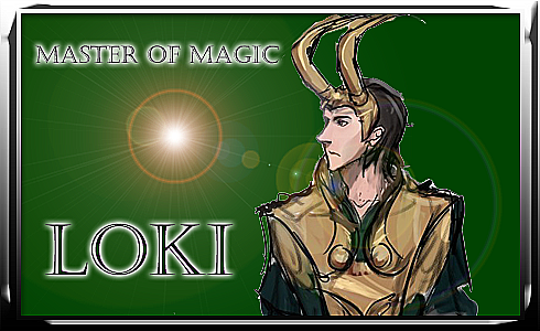
Do you think I did alright with my Loki sig? I did it all myself, and it was my first time working on something that detailed in photoshop, so I was afraid it'd turn out shitty. I like the way it looks, but I think I could have done better. Should the light on his staff have been white or is the reddish color more appropriate? Same with his titles. The mixture of green and white okay or should I have made them both the same color?
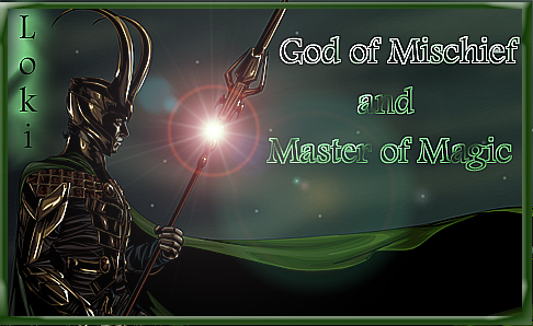
Also, does his armor look okay? I was trying to stick as close to the comics as possible, but it looks a little too golden I think, and I should have made it blacker, but then it wouldn't have shown up well against the stars. I was also thinking of a metallic silver border instead of the green one, and actually have a version that includes the silver border. I'm wondering if I should post it here and see which one ya'll like best.
Also, does his armor look okay? I was trying to stick as close to the comics as possible, but it looks a little too golden I think, and I should have made it blacker, but then it wouldn't have shown up well against the stars. I was also thinking of a metallic silver border instead of the green one, and actually have a version that includes the silver border. I'm wondering if I should post it here and see which one ya'll like best.