
okay i have been doing alot of work with graphics lately and i am getting pretty close to deciding on final designs for some small rank images not sure how big i can make em so i went with the recommended 100X20 that Phpbb recommends if i can go any bigger i would like to know
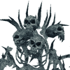
anyway the color schemes are based off what expansion the rank's armorset is found in for example cryptstalker is now a WotLK armor so i gave it an icy blue background with snow on it (see below) while riftstalker is from BC so green flames like fel fire are used in the background.
anyway im still a bit away from having anything finalized so feedback is welcome but please dont critisize just tell me stuff i might be able to make better
Forum Style and Rank images *work in progress*
-
Zangor
- Community Resource

- Posts: 1602
- Joined: Tue Jan 05, 2010 7:56 pm
- Realm: Lightbringer-US Nessingwary-US
- Gender: The Manliest Man ever
- Location: Aincrad
Forum Style and Rank images *work in progress*
- Attachments
-
- RiftStalker.png (6.38 KiB) Viewed 2015 times
-
- cryptstalker.png (8.16 KiB) Viewed 2015 times
-
Saturo

- Posts: 18809
- Joined: Sun Jan 10, 2010 5:21 pm
- Gender: Mortally impaired geekgirl
- Location: My secret lair on Skullcrusher Mountain.
Re: Forum Style and Rank images *work in progress*
If you don't want criticism, how do you expect to improve?
I would try giving them a clearer border and another font. Keeping it simple, basically.
I would try giving them a clearer border and another font. Keeping it simple, basically.
I also exist on DeviantArt.
"I'll probably be some kind of scientist, building inventions in my space lab in space!"
Moderation note: Saturo is banned from all forums except the RP forum, and only allowed there until the current RP thread ends.
-
Vephriel
- Illustrious Master Hunter

- Posts: 16434
- Joined: Wed Jan 06, 2010 8:07 pm
- Realm: Wyrmrest Accord US
- Gender: Female
- Location: Canada
Re: Forum Style and Rank images *work in progress*
First thing I'd say is that the text is illegible. I can't make out the letters in Cryptstalker, and Riftstalker I can only barely see because I know what it's supposed to say. I'm assuming you created the images on a larger scale and then shrunk them down afterwards. The problem with this, especially when dealing with text, is that details will blur together and sometimes become indistinguishable. It's better to work from the intended size at the beginning so you don't worry about information loss after resizing.
Also, since the base is going to be so tiny you might want to limit yourself to a simpler font. Elaborate ones look great at normal size, but with that minimal space you won't be able to make anything out.
Also, since the base is going to be so tiny you might want to limit yourself to a simpler font. Elaborate ones look great at normal size, but with that minimal space you won't be able to make anything out.
-
Zangor
- Community Resource
- Posts: 1602
- Joined: Tue Jan 05, 2010 7:56 pm
- Realm: Lightbringer-US Nessingwary-US
- Gender: The Manliest Man ever
- Location: Aincrad
Re: Forum Style and Rank images *work in progress*
heres the concept for a new logo its not done yet but its pretty far along by now
also i am not sure what dimensions i should make the images because i think there is a size limit and i need to figure that out first
also i am not sure what dimensions i should make the images because i think there is a size limit and i need to figure that out first
- Attachments
-
- Logo idea.png (24.83 KiB) Viewed 2015 times
-
Kalliope
- Illustrious Master Hunter
- Posts: 14063
- Joined: Wed Jan 06, 2010 4:40 am
- Realm: Dethecus
- Location: Thedas
- Contact:
Re: Forum Style and Rank images *work in progress*
^Vephriel wrote:First thing I'd say is that the text is illegible.
Also, since the base is going to be so tiny you might want to limit yourself to a simpler font. Elaborate ones look great at normal size, but with that minimal space you won't be able to make anything out.
This.
The logo is pretty cluttered for being such a small size, and I think we're all used to the ghost saber/snow leopard representing Petopia. Not everyone can use spirit beasts, so it seems a little too "exclusive" for a site that appeals to hunters of all kinds.
Kalliope's Pantheon of Pets
YouTube Edition
Thanks to Serenith for the avatar and signature!
-
Zangor
- Community Resource
- Posts: 1602
- Joined: Tue Jan 05, 2010 7:56 pm
- Realm: Lightbringer-US Nessingwary-US
- Gender: The Manliest Man ever
- Location: Aincrad
Re: Forum Style and Rank images *work in progress*
thats just the clickable logo im going to add other stuff like devilsaurs and stuff i just need to figure out how big the image for the bar at the top should be.....im not very good at coding and stuff but i can provide any images myself ill need to get specifics from mania if its possible
also i found a good reference for rank images and ill use the size these are
also i found a good reference for rank images and ill use the size these are
- Attachments
-
- rank_bars.png (10.02 KiB) Viewed 2015 times
-
Kalliope
- Illustrious Master Hunter
- Posts: 14063
- Joined: Wed Jan 06, 2010 4:40 am
- Realm: Dethecus
- Location: Thedas
- Contact:
Re: Forum Style and Rank images *work in progress*
Not all hunters can tame devilsaurs either.
Jus' sayin'.
Jus' sayin'.
Kalliope's Pantheon of Pets
YouTube Edition
Thanks to Serenith for the avatar and signature!
-
Zangor
- Community Resource
- Posts: 1602
- Joined: Tue Jan 05, 2010 7:56 pm
- Realm: Lightbringer-US Nessingwary-US
- Gender: The Manliest Man ever
- Location: Aincrad
Re: Forum Style and Rank images *work in progress*
i said devilsaur and other stuff i meant other families besides spirit beasts there will be wolves and raptors and bears on it as well
-
Saturo
- Posts: 18809
- Joined: Sun Jan 10, 2010 5:21 pm
- Gender: Mortally impaired geekgirl
- Location: My secret lair on Skullcrusher Mountain.
Re: Forum Style and Rank images *work in progress*
I would just use a neutral, rounded border, with the text in Verdana or such. You need to keep it simple, really, and those pictures aren't simple.
And why would we need a new forum-logo? I think Karathyriel did a damned good job with the picture we have now, you'll have some serious problems replacing it.
And why would we need a new forum-logo? I think Karathyriel did a damned good job with the picture we have now, you'll have some serious problems replacing it.
I also exist on DeviantArt.
"I'll probably be some kind of scientist, building inventions in my space lab in space!"
Moderation note: Saturo is banned from all forums except the RP forum, and only allowed there until the current RP thread ends.
-
Zangor
- Community Resource
- Posts: 1602
- Joined: Tue Jan 05, 2010 7:56 pm
- Realm: Lightbringer-US Nessingwary-US
- Gender: The Manliest Man ever
- Location: Aincrad
Re: Forum Style and Rank images *work in progress*
i finished all rank images but im not yet ready to release them but heres what i did for most of them backgrounds are blue,green,icy pattern to reflect where the armor set is found at this point in time (BC=green Vanilla=Blue Wrath=Ice)
text is now much easier to read and is colored after the primary color found in the armor (for example demonstalker is brown)
text is now much easier to read and is colored after the primary color found in the armor (for example demonstalker is brown)
- Attachments
-
- Gronnstalker.png (7.82 KiB) Viewed 2015 times
-
- Cryptstalker.png (9.31 KiB) Viewed 2015 times
-
- Giantstalker.png (6.67 KiB) Viewed 2015 times
-
Bulletdance
- Community Resource
- Posts: 2235
- Joined: Thu Jan 14, 2010 6:20 pm
- Realm: Vek'nilash
- Location: PA
Re: Forum Style and Rank images *work in progress*
Very cool, green one is my fav
Flight Rising Lair
http://flightrising.com/main.php?p=lair&id=26145
-
Zangor
- Community Resource
- Posts: 1602
- Joined: Tue Jan 05, 2010 7:56 pm
- Realm: Lightbringer-US Nessingwary-US
- Gender: The Manliest Man ever
- Location: Aincrad
Re: Forum Style and Rank images *work in progress*
here are the hunter trainer stable master and admin images each is a metalic color going from bronze to gold
- Attachments
-
- Admin.png (7.88 KiB) Viewed 2015 times
-
- Stable Master.png (8.37 KiB) Viewed 2015 times
-
- Hunter Trainer.png (7.9 KiB) Viewed 2015 times
-
Saturo
- Posts: 18809
- Joined: Sun Jan 10, 2010 5:21 pm
- Gender: Mortally impaired geekgirl
- Location: My secret lair on Skullcrusher Mountain.
Re: Forum Style and Rank images *work in progress*
Hmm... Think you could do something with round corners instead? Those will look a bit out of place if they're just squares with words in them.
I also exist on DeviantArt.
"I'll probably be some kind of scientist, building inventions in my space lab in space!"
Moderation note: Saturo is banned from all forums except the RP forum, and only allowed there until the current RP thread ends.
-
Karathyriel
- Community Resource
- Posts: 2133
- Joined: Mon Jan 11, 2010 6:07 pm
- Realm: Not playing anymore.
- Location: Germany
Re: Forum Style and Rank images *work in progress*
This is just my opinion:
If you only use words, wh not keep the ranks the way they are right now?
At least, they are good to read.
The logo, as was said, should still be the ghost saber. Everyone on Petopia knows the ghost saber.
And, to be honest, if Mania is to keep this forums style as it is, there is hardly anything you can fit into the blue/silver design without making it look odd. When this forum started, there has been a discussion about the look and feel of the forums and here ya go: It never changed.
But don't stop creating. You never know what might come out of it.
-
Saturo
- Posts: 18809
- Joined: Sun Jan 10, 2010 5:21 pm
- Gender: Mortally impaired geekgirl
- Location: My secret lair on Skullcrusher Mountain.
Re: Forum Style and Rank images *work in progress*
Exactly. The way the forums are now, the colorful look won't fit in at all. That's why I say neutral colours and rounded borders, if even that.Karathyriel wrote:This is just my opinion:
If you only use words, wh not keep the ranks the way they are right now?
At least, they are good to read.
The logo, as was said, should still be the ghost saber. Everyone on Petopia knows the ghost saber.
And, to be honest, if Mania is to keep this forums style as it is, there is hardly anything you can fit into the blue/silver design without making it look odd. When this forum started, there has been a discussion about the look and feel of the forums and here ya go: It never changed.
But don't stop creating. You never know what might come out of it.
I also exist on DeviantArt.
"I'll probably be some kind of scientist, building inventions in my space lab in space!"
Moderation note: Saturo is banned from all forums except the RP forum, and only allowed there until the current RP thread ends.

Re: Forum Style and Rank images *work in progress*
Gonna be completely honest with all of this, but I'm just trying to help you out.
The first batch were completely illegible. You obviously worked on a larger scale and shrunk them down, which is a bad idea for anything that requires small details. If you want something small, work on a small scale. Shrinking things distorts the proportions and blurs them, which is the last thing you want for something you can read.
The bars you suggested do not fit petopia at all, at least in my opinion.
As for the last two batches you made.. The text contrasts with the background far, far too much. Putting a bright blue on tannish/gold is a terrible combination, like trying to see highlighter on bright white paper. Also, in my opinion, the backgrounds you chose for those images were distasteful and not well made. Don't be afraid to take your time on things out of the fear of keeping people waiting. The effects you used on them just seemed unnecessary in the end, and going with the 3-D rectangular look makes me feel robotic, which Petopia is not.
I feel like you think Petopia will be using these images. To that I say, don't see yourself so highly. Putting it off as if we're going to be using these images and then saying "no critique plz" is childish. If you want a community with hundreds of users to be using your images, think hard about the designs beforehand and then use the critique people give you.