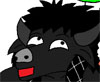
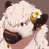
Updated post: as I didn't want to make an entirely new thread, here is the Worg I've been working on today. It isn't the best on earth, and his fur came out looking rather like a bison's

But I'm proud of it nonetheless. You'll see lots of people helping me further on in the thread, so, thanks guys

Hopefully I will be able to take your suggestions & improve; all further suggestions, critiques and comments are welcome.
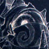
Original Image in all its gigantic glory
Just the portrait (updated for furry goodness)

As promised, for those who would like to give suggestions,
here are the steps in which I created the image. No text to accompany, I'm afraid, but it's pretty self-explanatory. Hopefully if someone sees a massive flaw, they can tell me where in my process I went wrong!
Original post follows.
* * * * *
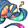
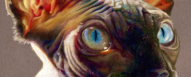
I drew this up while testing a new shading style, and wanted to share. It's not great, and certainly not polished (which I'm never particularly good at anyway)--it was drawn on quite a low resolution. Still, someone might get some enjoyment out of it. It's a young WoW drake, or WoW-inspired anyway
 Posted on DA here.

All in all I'm pretty happy with the style and may use it in the future, although it's REALLY time-intensive. But I'd like
comments & opinions on whether it's pleasing to the eye, and whether anything in particular (either with the drawing itself or the style) would look better with a change!
(Edit--I'm aware he's "missing" one arm, and that one of his legs is stupidly long >.<)